You Don't Need a Designer
Every major artist has a creative team-art directors, graphic designers, photographers, all working together to craft their visual identity. As an independent musician, you probably don't have that luxury. And honestly? That's fine.
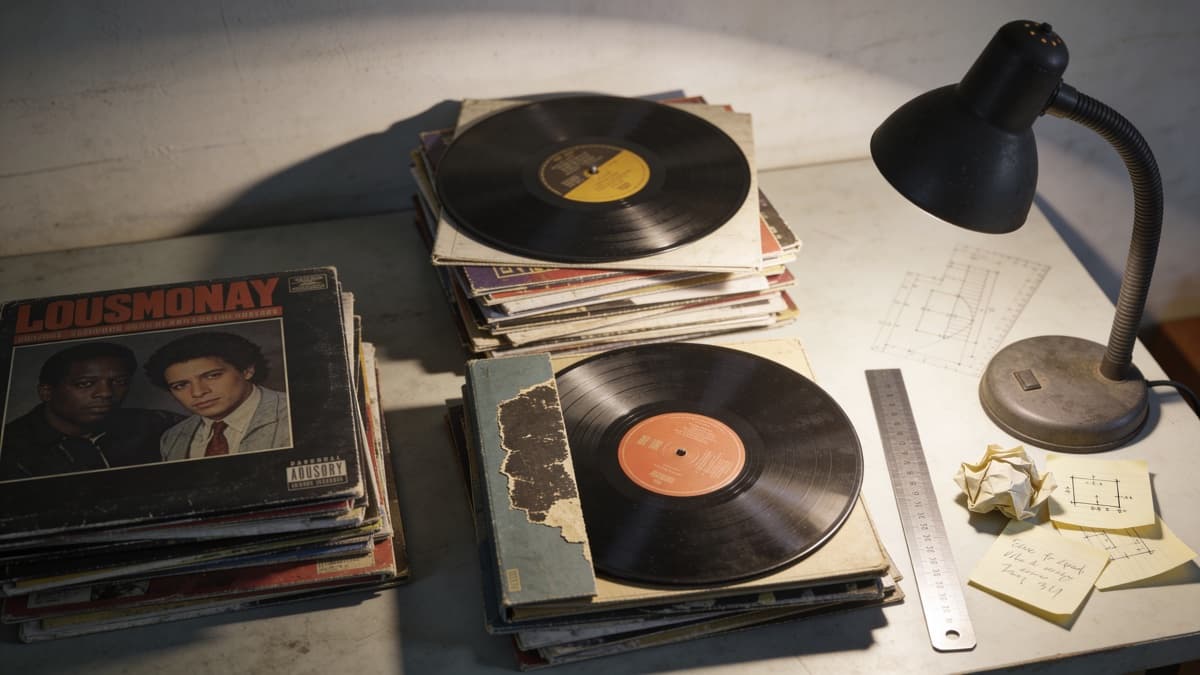
Some of the most iconic album covers in history were created with minimal resources and maximum creativity. Joy Division's Unknown Pleasures was generated from a scientific data visualization. The Velvet Underground's banana was literally just a banana. Bon Iver's For Emma, Forever Ago featured a simple cabin photograph that perfectly matched the album's intimate isolation. You don't need a big budget to create something memorable.
This guide shows you how to create professional-looking artwork without formal design training or significant investment. We'll cover free tools, practical techniques, and when it actually makes sense to spend money.
The best album cover isn't necessarily the most expensive or technically impressive-it's the one that genuinely represents your music.
Free Design Tools That Actually Work
Professional design software like Adobe Photoshop and Illustrator costs $20-55 per month. That adds up, especially when you're investing in recording, distribution, and promotion. Fortunately, free alternatives have matured to the point where they can produce professional results.
Canva offers the gentlest learning curve. Their free tier includes album cover templates pre-sized at correct dimensions, a drag-and-drop interface that requires no design experience, and a library of free photos and graphics. You can export at 3000 x 3000 pixels on the free plan-sufficient for all streaming platforms. The tradeoff is limited customization compared to professional software, but for straightforward covers, Canva is genuinely sufficient.
Photopea is effectively Photoshop in your browser, completely free. It supports layers, masks, adjustment layers, and most of the features professional designers rely on. The interface mirrors Photoshop closely enough that tutorials for one largely apply to the other. No account required-just open the website and start working. The learning curve is steeper than Canva, but the creative possibilities are far broader.
GIMP is the established open-source alternative for desktop software. It's powerful, works offline, and has been refined over decades of development. The interface differs from Adobe conventions, which can be disorienting if you're following Photoshop tutorials, but extensive GIMP-specific resources exist. For complex compositions requiring professional-grade features, GIMP delivers without cost.
The AI Shortcut
If learning design software isn't appealing-or if you simply want results faster-AI image generation has become a legitimate option for album artwork. Tools like ReleasKit let you describe your vision and generate multiple concepts in minutes, no design skills required.
The appeal is obvious: you answer some questions about your music's mood and themes, and the AI produces polished, platform-ready artwork. For artists who release frequently, this consistency matters. You're not starting from scratch with each single, learning new software, or managing freelancer relationships. You describe what you want and get usable results.
AI makes particular sense when design genuinely isn't your interest. Some musicians find deep satisfaction in visual creation; others want to focus entirely on the music and treat artwork as a necessary deliverable rather than a creative outlet. Neither approach is wrong-they're just different relationships with the visual side of releasing music.
For detailed comparison of available tools, see our guide to AI album cover generators.
AI doesn't replace creativity-it's a tool like any other. The quality of output still depends on the clarity of your vision.
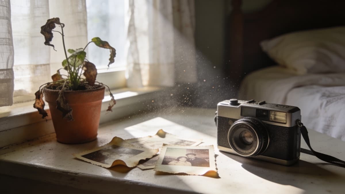
The Photography Approach
Some of the most effective album covers are simply great photographs. No graphic design, no complex compositions-just an image that captures something true about the music.
Your phone camera is probably sufficient. Modern smartphone cameras exceed the resolution requirements for streaming platforms and handle challenging lighting better than dedicated cameras from just a decade ago. The constraint isn't equipment; it's developing an eye for what works.
Good natural light transforms ordinary subjects. Golden hour-the hour after sunrise or before sunset-produces warm, flattering illumination that requires no additional equipment. Overcast days create soft, even light that works well for portraits. Harsh midday sun is rarely flattering, but you can use it intentionally for high-contrast, dramatic effects.
Consider what to photograph. Artist photos create personal connection with listeners-they see who made this music. Objects representing the album's themes can be evocative: the view from a studio window, instruments in their cases, handwritten lyrics. Textures and abstract patterns work well for electronic or ambient music where literal imagery might feel too constraining. Urban environments, natural landscapes, and domestic scenes all have potential depending on your music's character.
After shooting, editing apps like Lightroom Mobile (free) or VSCO can refine colors, adjust exposure, and add subtle treatments that unify your visual identity across releases. Don't over-process-the best edits are often invisible, serving the image rather than drawing attention to themselves.
Typography: Less Is More
Typography is where DIY album covers most often go wrong. Inexperienced designers tend to use too many fonts, place text awkwardly, and choose typefaces that clash with their imagery. The good news: typography rules are learnable, and restraint goes a long way.
Start with a simple principle: one to two fonts maximum. One for your artist name, one for the title (or the same font for both). More than two fonts rarely adds value and usually creates visual noise. Within those fonts, you have weight and size variations-use those for hierarchy instead of introducing additional typefaces.
Placement matters enormously. Don't obscure important parts of your imagery with text. Consider where streaming platforms place their own UI elements-the bottom-left corner often gets overlaid with play buttons. Test your cover at thumbnail size (around 100 x 100 pixels) to ensure text remains readable. If you can't read your artist name at thumbnail scale, listeners scrolling through playlists won't either.
For free fonts that work across genres, Google Fonts offers commercial-use licensing at no cost. Inter provides clean, modern versatility. Bebas Neue delivers bold impact for titles. Space Mono suits technical or electronic aesthetics. Playfair Display carries classical elegance. These aren't the only options-they're starting points when you're unsure where to begin.
Know Your Genre Conventions
Every genre has visual conventions that listeners have come to expect-patterns established over decades of album releases. Understanding these conventions lets you make informed choices about whether to embrace or subvert them.
Hip-hop traditionally features bold colors, artist photographs (often highly stylized), and strong typographic presence. Text is frequently large, sometimes dominating the composition. Luxury signifiers-jewelry, fashion, cars-appear regularly. Recent trends lean toward minimalism and high-fashion influence, but the core emphasis on artist identity remains.
Indie and lo-fi aesthetics favor muted color palettes, film grain, and analog textures. Photographs often appear deliberately imperfect-out of focus, oddly cropped, nostalgically colored. Hand-drawn elements, vintage typography, and DIY aesthetic signal authenticity. The "accidentally beautiful" look requires surprisingly careful intention to achieve.
Electronic music spans enormous visual territory but often gravitates toward abstract imagery, geometric patterns, and either neon vibrancy or stark monochrome. Futuristic and digital motifs appear frequently. Artist photos are less common; the music often supersedes personal identity. For genre-specific guidance, see our electronic & EDM cover trends analysis.
Metal maintains its own distinct visual language: dark, often macabre imagery; detailed illustration work; custom lettering that borders on illegible (intentionally). The aesthetic signals intensity and seriousness that matches the music.
Pop emphasizes polish, brightness, and artist presence. Photographs are highly produced; colors are saturated; everything looks expensive and intentional. The visual goal is mainstream accessibility and aspirational glamour.
Study covers in your genre. Note what elements appear repeatedly. Then decide: are you working within the convention to signal genre membership, or deliberately breaking expectations to stand apart?
Mistakes to Avoid
Certain amateur tells immediately signal inexperience to viewers, undermining the perceived quality of your music before anyone hits play. Avoiding these mistakes matters as much as any positive technique.
Obviously stock photography is one of the most common issues. We've all seen generic business people pointing at charts or models laughing at salads. Stock imagery can work when used cleverly or as a conceptual statement, but default corporate photography on an album cover looks like you gave up. If you use stock, choose images that don't feel obviously stock-and consider how unusual framing or editing might make generic images feel intentional.
Excessive effects are another trap. Lens flares, dramatic filters, heavy vignettes, and overdone HDR make images look processed rather than professional. Effects should serve the image, not advertise your filter collection. When in doubt, less is more. A simple, well-composed photograph beats an over-processed one.
Cluttered compositions result from trying to include everything. Album covers work best with clear focus-one central element, one key message. Filling every inch of space creates visual noise that exhausts rather than engages. Leave room for the image to breathe.
Low resolution appears pixelated and unprofessional at streaming display sizes. Always work at 3000 x 3000 pixels minimum; see our complete size guide for exact platform requirements. Upscaling low-resolution images rarely produces acceptable results-start with sufficient resolution or find better source material.
Poor font choices undermine otherwise good designs. Avoid fonts with strong associations to other contexts (Comic Sans screams "amateur"; Papyrus says "yoga studio"). Choose typefaces that complement your imagery and genre expectations.
Plagiarism damages your reputation and potentially creates legal liability. Drawing inspiration from covers you admire is normal; directly recreating them is not. Study what makes effective covers work, then apply those principles to original work.
Before You Export: Final Checklist
Before uploading to your distributor, run through these technical and visual checks to catch issues before they become rejections or embarrassments.
Verify your dimensions are exactly 3000 x 3000 pixels or higher. Streaming platforms reject non-square artwork, and anything below minimum resolution requirements will be refused. For Apple Music specifically, consider exporting at 4000 x 4000 pixels.
Confirm your color space is sRGB. CMYK artwork (designed for print) appears dull and washed-out on screens. Convert before exporting if you've been working in any other color profile.
Save in appropriate format: JPG at 90-95% quality for photographs and complex imagery; PNG for designs with text, sharp edges, or flat colors. Note that Deezer only accepts JPG.
Ensure file size remains under 20MB. This is rarely an issue at correct quality settings, but worth checking.
Test thumbnail appearance. Shrink your cover to approximately 100 x 100 pixels. Is text still readable? Can you identify the key visual elements? This is how your artwork will appear in most browsing contexts.
View on different backgrounds. Your cover will appear against light interfaces, dark interfaces, and various colored contexts. Make sure edges and important elements remain visible in both extremes.
Check for spelling errors. It sounds obvious, but your artist name and track title permanently attached to this artwork. Proofread carefully.
Confirm all text is legible at various sizes. If any text is decorative rather than informational, that's fine-but anything meant to be read should actually be readable.
FAQ